

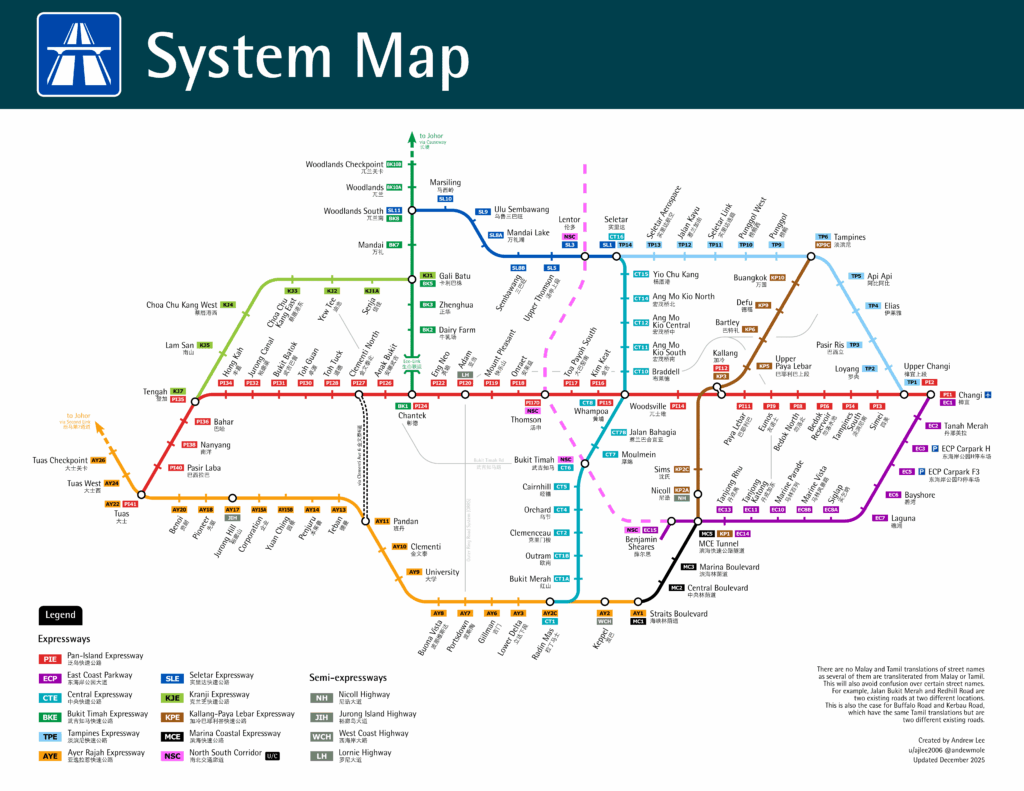
A Singaporean resident, posting on Reddit under the username ajlee2006, has turned a long-held idea into a striking visual representation of Singapore’s expressway network, mapping every exit in the style of the city’s familiar underground rail diagram. The post has drawn strong interest online, with hundreds of responses commenting on both its design and usefulness.
The graphic, created using the vector illustration tool Inkscape, reimagines Singapore’s expressways as if they were rail lines. Instead of stations, each “stop” on the diagram corresponds to an expressway interchange or exit, and the overall presentation mirrors the style of transit maps familiar from the MRT network.
According to the creator, the project began as a conceptual sketch that had “been in [their] head for some time” before they finally compiled research and learned enough of the design software to make it. A triangular grid was used in the design to ensure clean 60-degree angles, giving the map crisp, harmonised linework rather than the right-angle bends seen in many transport schematics.
Every exit was carefully referenced against authoritative sources. The map’s “station names” were taken from the list of expressway exits on Wikipedia, and verified with Singapore’s OneMap service to confirm official flyover names. Where a flyover name did not exist, the designer used a major connecting road name instead. Furthermore, exit codes on the diagram reflect real expressway exit numbers; for example, the Thomson Flyover is labelled “17D” to match its actual designation on the Pan-Island Expressway.
The designer also included directional tick marks on the lines to indicate whether the feeder road connects only in one direction, such as Senja Road’s southbound connection to the Kranji Expressway, adding a layer of accuracy beyond mere aesthetics.
Colours were selected to align as closely as possible with established transport line colours from the Land Transport Authority, helping reinforce the visual parallel with transit maps. Fonts chosen included those commonly seen on road signs, ensuring legibility and recognisability.
While Nicoll, Jurong Island, West Coast, and Lornie highways are technically semi-expressways due to lower speed limits and traffic lights, the creator opted to include them alongside true expressways. Bukit Timah Road and parts of the Outer Ring Road System were also incorporated to provide greater network continuity.
Responses from the community ranged from praise for the creativity to light-hearted observations about Singapore’s road geometry. One commenter noted that the expressway lines visually form a loop, with only Changi, Tuas and Woodlands acting as open ends — a structural insight that is less obvious in map or on-road navigation. Others compared the design’s aesthetic to that of the city’s rail schematic, with some expressing plans to save or even print the map.
Some detailed comments also explored potential tweaks, like adjusting colour assignments to better reflect compass directions or debating how nuances of limited-direction access at certain exits could be depicted without cluttering the map. In one exchange, the creator explained their choice for using official flyover names as the primary labels, rather than alternative landmark-based naming used colloquially.
Overall, the map has been widely received as both an engaging piece of graphic design and a novel way to visualise Singapore’s expressway infrastructure, inviting viewers to reconsider the familiar road network through the lens of transit cartography.